How Many Self Storage Facilities Are Contacted Before a Renter Rents?
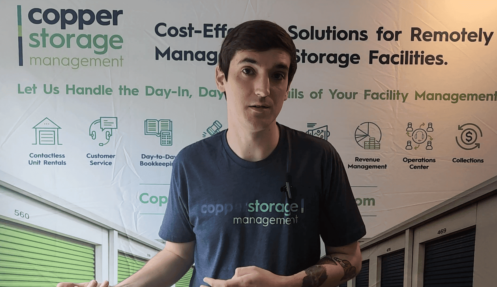
I’m Brett Copper with Copper Storage Management. We have a third party management company in self storage that focuses on remote management all over the country. I’ve started a video series that we’re going to keep continuing. Hopefully every month here for a while on really short tidbits in the industry, really quick pieces of information that I think are very valuable.
Hopefully everybody else finds are very valuable as well. For this week, what we’re basically focusing on is why do tenants choose you? What do they want to see? see on your website or your marketing that is going to get them the information they’re looking for the quickest to hopefully call you or come to your store and be able to secure that rental.
For a really long time, most tenants wanted pictures of how clean the facility was. They wanted to make sure it was safe and that it was close. The industry is drastically changing pretty quick with the economy. So now let’s take a look at what those most important factors are and how that can affect.
Affect how you’re marketing to those tenants. Pricing still remains the most important piece of information that a tenant wants to see. It should be no surprise. That is the the number one thing in a tenant’s mind. So make sure when they hit your landing page for the facility, soon as they find you on Google or wherever it is that they find you, if they type in your U R L.
That the first thing that they can see is pricing, even if in the, in the main view that they’re seeing, there’s only one or two rows visible. That way they know to scroll down to see the rest of it. It is vital that you show pricing so that they don’t just leave the page, get frustrated and go on. The next person size of units and availability of units.
Obviously essential. They want to know what it is you have available. What’s it going to cost? Uh, what sizes do you have? Is it climate non climate? Make sure all of that is there. And that’s important. If you don’t have units that are available, uh, or different sizes, make sure you use something like call for availability, that’s essential because then they can at least call in.
You can try and talk them into another unit size, or if there isn’t a way to, you know, help them in that case. You can put them on a list and call them back once a unit is available. Location is obvious, you know, they need to be able to find the facility. Having, you know, some sort of Google Maps integration, something like that is pretty helpful.
Hours of operation, this is very important if you are running most modern facilities where you’re doing a form of automation or remote management, uh, or you’re Doing full remote management, like us, make sure you put call center hours or contact center hours instead of office hours. Uh, that way tenants don’t show up and get frustrated.
Our call centers open 12 hours a day, seven days a week. So we do call center hours and then we show access hours so they can get to the facility 6 AM to 10 PM. We also let them know they can rent 24 seven. All, all essential pieces. Features then being at the bottom. Uh, whether that’s drive up, two door, whatever it is.
Uh, the main distinction though is climate controlled and non climate. That’s obviously always a big decision for people. But the rest of the features are less important. And then the thing I like the most is that all other things only make up 1%. We do not need to waste our time talking about the Boys and Girls Club locally.
Uh, you know, your, your grandfather’s grandfather built this facility and then passed it down. None of that stuff is important to these tenants. So you can still have it on your website, on another page, maybe an about us, that kind of thing. But when it comes to the facility landing page, only show them what they’re looking for and what is essential.
So it’s very, very important that we’re modern with. What our websites look like. We need to make sure that it’s simple, easy, and fast. And all the tenants get exactly what they’re looking for. Almost immediately. The name of the game should be simplicity. It doesn’t matter to add all of these expensive pieces, drone flyover to these interactive maps that get extremely complicated.
It’s okay to have those things, but have those be secondary instead of the main focus of the website. Make sure all of these pieces of information, price, availability, size, type of unit. All of that needs to be readily available. And then if the tenant wants to dive in further to the facility and see some of those other pieces, it’s great.
Thanks.


